NASA has just revealed the James Webb Space Telescope’s first set of images, from an awe-inspiring deep field of galaxies to a minute characterization of a distant exoplanet’s atmosphere. But how does a spacecraft a million miles away get dozens of gigabytes of data back to Earth?
First let’s talk about the images themselves. These aren’t just run of the mill .jpgs — and the Webb isn’t just an ordinary camera.
Like any scientific instrument, the Webb captures and sends home reams of raw data from its instruments, two high-sensitivity near- and mid-infrared sensors and a host of accessories that can specialize them for spectroscopy, coronography, and other tasks as needed.
Let’s take one of the recently released first images with a direct comparison as an example.
Megapixel race
The Hubble, which is more comparable to a traditional visible-light telescope, took this image of the Carina Nebula back in 2008:
Of course this is an incredible image. But the Hubble is more comparable to a traditional visible-light telescope, and more importantly it was launched back in 1990. Technology has changed somewhat since then!
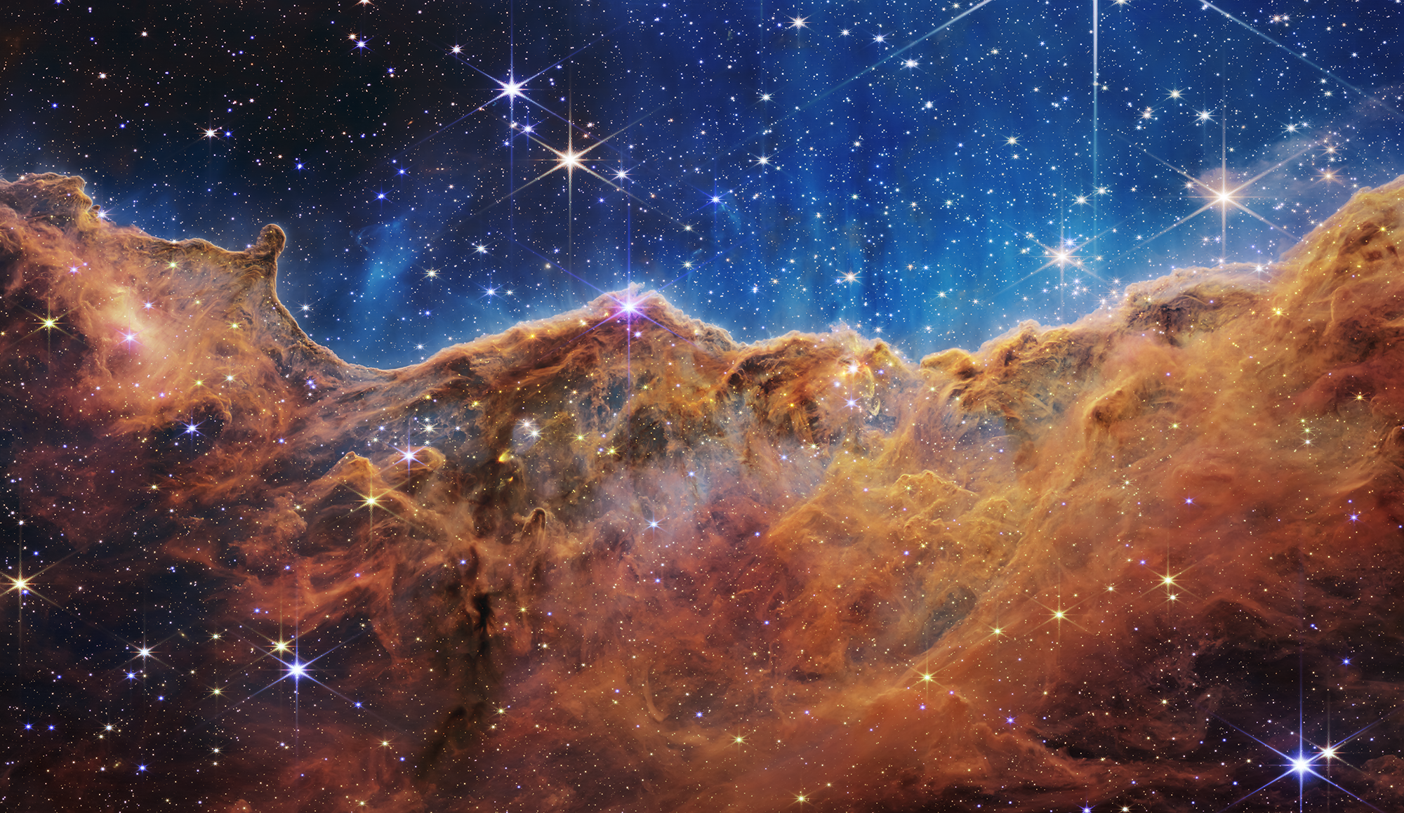
Here’s the Webb’s version of that same region:

Image Credits: NASA, ESA, CSA, STScI
It’s plain to any viewer that the Webb version has far more detail even looking at these small versions. The gauzy texture of the nebula resolves into intricate cloud formations and wisps, and more stars and presumably galaxies are clear and visible. (Though let us note here that the Hubble image has its own charms.)
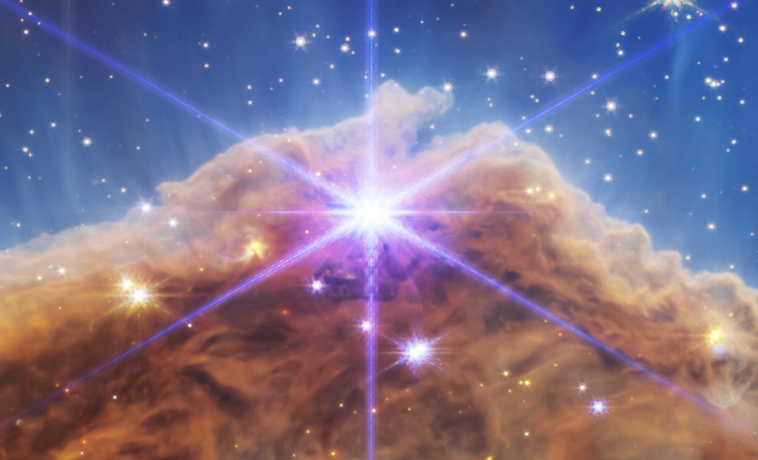
Let’s just zoom in on one region to emphasize the level of detail being captured, just left and up from center:

Image Credits: NASA, ESA, CSA, STScI
Extraordinary, right? But this detail comes at a cost: data!
The Hubble image is about 23.5 megapixels, weighing in at 32 megabytes uncompressed. The Webb image (as made available post-handling) is 123 megabytes and approximately 137 megabytes. That’s more than five times the data, but even that doesn’t tell the whole story. The Webb’s specs have it sending data back at 25 times the throughput of the Hubble — not just bigger images, but more of them… from 3,000 times further away.
Long distance call
The Hubble is in a low-Earth orbit, about 340 miles above the surface. That means communication with it is really quite simple — your phone reliably gets signals from GPS satellites much further away, and it’s child’s play for an scientists at NASA to pass information back and forth to a satellite in such a nearby orbit.
JWST, on the other hand, is at the second Lagrange point, or L2, about million miles from the Earth, directly away from the sun. That’s four times as far as the Moon ever gets, and a much more difficult proposition in some ways. Here’s an animation from NASA showing how that orbit looks:
Fortunately this type of communication is far from unprecedented; we have sent and received large amounts of data from much further away. And we know exactly where the Webb and the Earth will be at any given time, so while it isn’t trivial, it’s really just about picking the right tools for the job and doing very careful scheduling.
From the beginning, the Webb was designed to transmit over the Ka band of radio waves, in the 25.9 gigahertz range, well into the ranges used for other satellite communications. (Starlink, for instance, also uses Ka, as well as others up around that territory.)
That main radio antenna is capable of sending about 28 megabits per second, which is comparable to home broadband speeds — if the signal from your router took about five seconds to travel through a million miles of vacuum to reach your laptop.

Purely illustrative for a sense of the distances – objects are not to scale, obviously.
That gives it about 57 gigabytes of downlink capacity per day. There is a second antenna running at the lower S-band — amazingly, the same band used for Bluetooth, wi-fi, and garage door openers — reserved for low-bandwidth things like software updates, telemetry, and health checks. If you’re interested in the specifics, IEEE Spectrum has a great article that goes into more detail on this.
This isn’t just a constant stream, though, since of course the Earth spins and other events may intercede. But because they’re dealing with mostly known variables, the Webb team plans out their contact times four or five months in advance, relaying the data through the Deep Space Network. The Webb might be capturing data and sending it the same day, but both the capture and the transmission were planned long, long before.
Interestingly, the Webb only has about 68 gigabytes of storage space internally, which you would think would make people nervous if it can send 57 — but there are more than enough opportunities to offload that data so it won’t ever get that dreaded “drive full” message.
But what you see in the end — even that big uncompressed 123-megabyte TIFF image — isn’t what the satellite sees. In fact, it doesn’t really even perceive color at all as we understand it.
“Allowing the data to show through with color”
The data that comes into the sensors is in infrared, which is beyond the narrow band of colors that humans can see. We use lots of methods to see outside this band, of course, for example x-rays, which we capture and view in a way we can see by having them strike a film or digital sensor calibrated to detect them. It’s the same for the Webb.
“the telescope is not really a point and shoot camera. So it’s not like we can just take a picture and there we have it, right? It’s a scientific instrument. So it was designed first and foremost, to produce scientific results,” explained Joe DePasquale, of the Space Telescope Science Institute, in a NASA podcast.

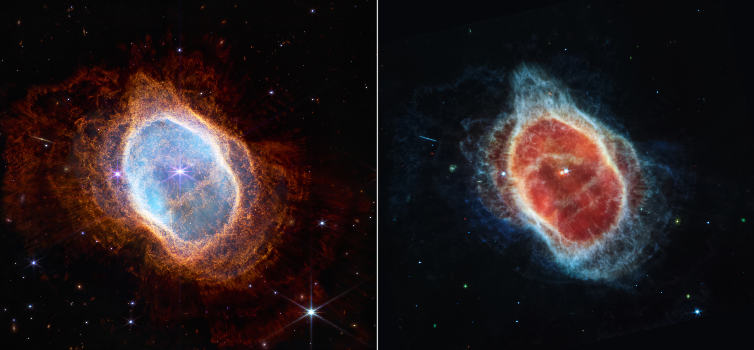
This side-by-side comparison shows observations of the Southern Ring Nebula in near-infrared light, at left, and mid-infrared light, at right, from NASA’s Webb Telescope.
What it detects is not really data that humans can parse, let alone directly perceive. For one thing, the dynamic range is off the charts — that means the difference in magnitude between the darkest and lightest points. There’s basically nothing darker than the infinite blankness of space, and not a lot brighter than an exploding sun. But if you have an image that includes both, taken over a period of hours, you end up with enormous deltas between dark and light in the data.
Now, our eyes and brains have pretty good dynamic range, but this blows them out of the water — and more importantly, there’s no real way to show it.
“It basically looks like a black image with some white specks in it, because there’s such a huge dynamic range,” said DePasquale. “We have to do something called stretch the data, and that is to take the pixel values and sort of reposition them, basically, so that you can see all the detail that’s there.”
Before you object in any way, first, be it known that this is basically how all imagery is created — a selection of the spectrum is cut out and adapted for viewing by our very capable but also limited visual system. Because we can’t see in infrared and there’s no equivalent of red, blue, and green up in those frequencies, the image analysts have to do complicated work that combines objective use of the data to subjective understanding of perception and indeed beauty. Colors may correspond to wavelengths in a similar order, or perhaps be divided up to more logically highlight regions that “look” similar but put out wildly different radiation.
“We like to in the, you know, imaging community in astrophotography like to refer to this process as ‘representative color,’ instead of what it used to be called, are still many people call ‘false color images.’ I dislike the term ‘false color,’ because it has this connotation that we’re faking it, or it’s, you know, this isn’t really what it looks like, the data is the data. We’re not going in there and applying, like painting color on to the image. We are respecting the data from beginning to end. And we’re allowing the data to show through with color.”
If you look at the image above, the two views of the nebula, consider that they were taken from the same angle, at more or less the same time, but using different instruments that capture different segments of the IR spectrum. Though ultimately both must be shown in RGB, the different objects and features found by inspecting higher wavelengths can be made visible by this kind of creative yet scientifically rigorous color-assignment method.
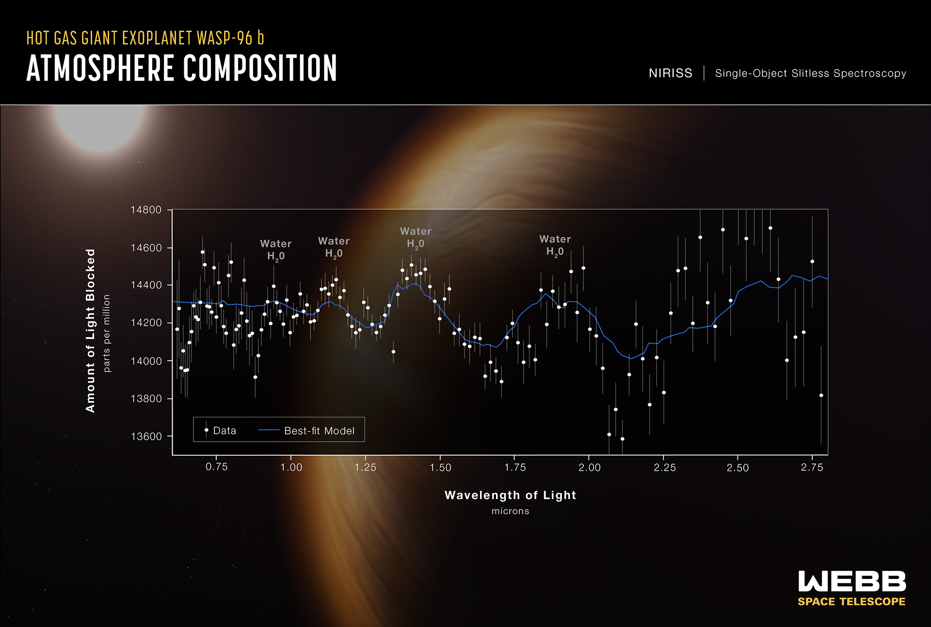
And of course when the data is more useful as data than as a visual representation, there are even more abstract ways of looking at it.

Image Credits: NASA, ESA, CSA, and STScI
An image of a faraway exoplanet may show nothing but a dot, but a spectrogram shows revealing details of its atmosphere, as you can see in this example immediately above.
Collecting, transmitting, receiving, analyzing, and presenting the data of something like the Webb is a complex task but one that hundreds of researchers are dedicating themselves to cheerfully and excitedly now that it is up and running. Anticipate even more creative and fascinating ways of displaying this information — with JWST just starting its mission a million miles out, we have lots to look forward to.

