As rising interest rates and declining affordability have lowered housing market demand, a correction (a modest decline in housing prices) has been looming for months. On a national scale, housing prices are still up almost 11% year-over-year, but other indicators point to a housing market that is starting to correct.
In this article, I will dive into several methods for measuring housing market health, identify metrics to watch, and label specific markets that are at the highest risk of seeing price declines in the coming months.
Market Data
When looking at the health of the housing market, we could examine many datasets and methodologies. For the purposes of this article, I am going to look at three datasets:
- Year-over-year (YoY) data (what happened in July 2022 compared to July 2021)
- Month-over-month (MoM) data (what happened in July 2022 compared to June 2022)
- Inventory (how many properties are actively listed for sale at a given point in time).
These provide a good balance of long-term trends, short-term changes, and forward-looking data.
Year-Over-Year Data
In normal times, YoY data is the best way to measure growth in housing prices because one, housing data is seasonal, and two, it measures long-term trends. Housing prices follow a similar pattern every year—they peak in the summer and decline over the winter—meaning that comparing January’s data to June’s is not helpful.
Median Home Price (2014-2019)
The chart above demonstrates this concept well. Clearly, housing prices were consistently trending upwards from 2014 to 2019, even though every year, housing prices fell from May to February. If we were to look at prices from May 2016 to January 2017, it would show falling prices, even though the market was trending upwards.
Again, this is why we look at YoY data, because what happened between July 2022 and July 2021 shows the long-term trends. And as mentioned above, YoY prices on a national level are still +11%. Of the top 250 markets in the United States, zero have seen YoY price declines. Not one!
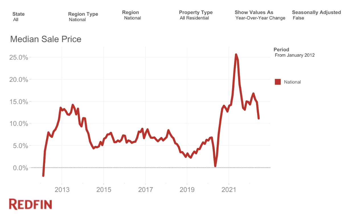 Median Sales Price YoY Change (2012-2022) – Redfin
Having the median home price increase 11% YoY is a massive number in historical contexts but does represent a significant cooling from the absurd growth rates we saw in 2020 and 2021. For context, during the Great Recession, housing prices fell YoY for several years in a row, with prices falling more than 10% YoY in 2009.
So, in today’s market, the growth rate of housing prices in the U.S. is returning to normal, but as the chart above shows, it is still well above historical norms. And although prices are still up YoY, we can learn something from how YoY data is trending. In some of the country’s hottest markets, YoY growth has fallen very fast, with Austin, Texas, leading the way.
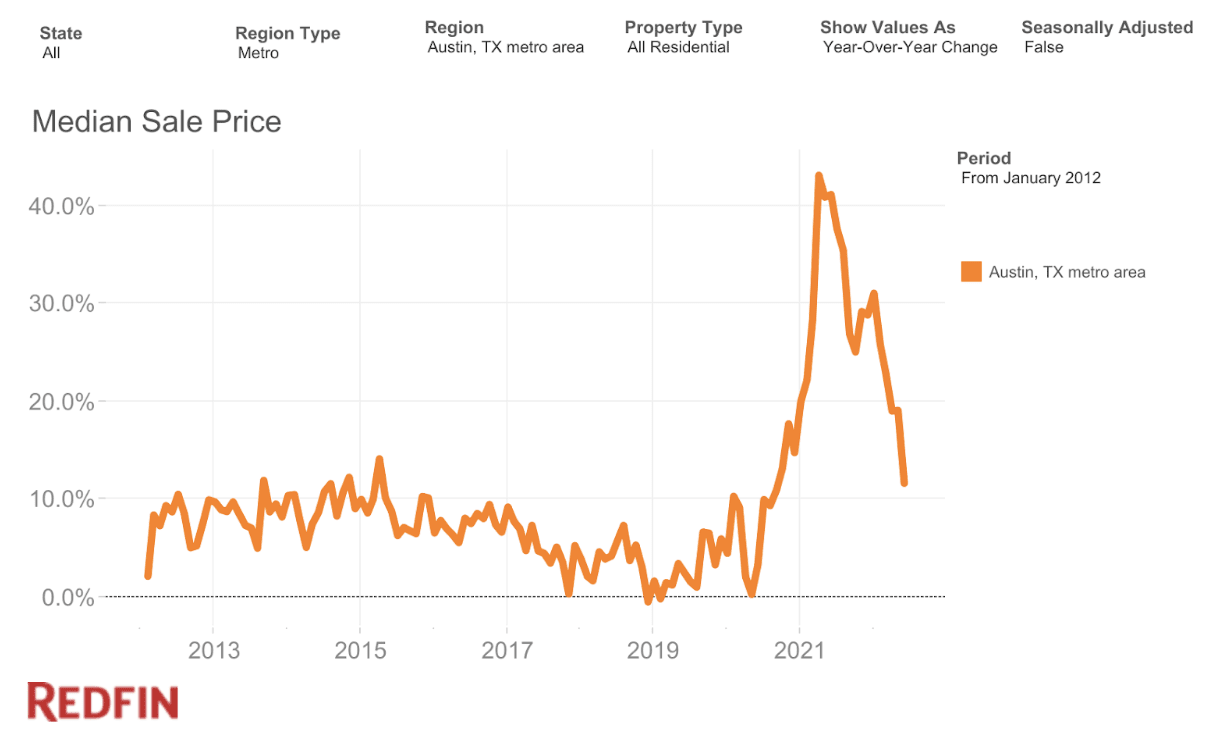 Median Sales Price YoY Change (Austin, Texas, 2012-2022) – Redfin
Austin grew at about 45% YoY last summer and is now down to about 11%. It’s still growing on a YoY basis, but to me, the rapid rate of deceleration represents risk to the Austin housing market. Austin is seeing its rate of growth fall faster than any other market.
Other markets that are seeing similar patterns are Seattle, Sacramento, Phoenix, San Jose, Boise, and San Diego, to name a few. Checking out the rate of change in YoY growth rates is a helpful thing you can do to better understand your market.
Month-Over-Month Data
As I said above, during a stable housing market, I personally believe YoY data to be the most important and don’t spend too much time on MoM data. But, during markets in transition, like the one we’re in currently, looking at MoM data can be helpful.
When examining the top 250 markets, the vast majority are still seeing increases, but 31 of them did see declines. San Jose, California, saw the steepest drop at -2.7%, but the average among the 31 markets in decline was modest at just -0.64% MoM. Here’s a list of the 31 markets within the top 250 that saw declines:
| Market | MoM % Change |
|---|---|
| San Jose, CA | -2.70% |
| Austin, TX | -1.62% |
| Reno, NV | -1.26% |
| San Diego, CA | -1.23% |
| Santa Cruz, CA | -1.06% |
| San Francisco, CA | -0.93% |
| Boulder, CO | -0.91% |
| Seattle, WA | -0.90% |
| Provo, UT | -0.89% |
| Salt Lake City, UT | -0.83% |
| Ogden, UT | -0.81% |
| Portland, OR | -0.78% |
| Denver, CO | -0.65% |
| Boise City, ID | -0.61% |
| Atlantic City, NJ | -0.57% |
| Ventura, CA | -0.50% |
| Vallejo, CA | -0.50% |
| Phoenix, AZ | -0.42% |
| Spokane, WA | -0.35% |
| Stockton, CA | -0.34% |
| Los Angeles-Long Beach-Anaheim, CA | -0.33% |
| Medford, OR | -0.32% |
| Pittsburgh, PA | -0.30% |
| Colorado Springs, CO | -0.27% |
| Visalia, CA | -0.16% |
| Santa Rosa, CA | -0.13% |
| Lincoln, NE | -0.12% |
| Greeley, CO | -0.12% |
| Sacramento, CA | -0.09% |
| Riverside, CA | -0.08% |
| Worcester, MA | -0.06% |
On the other hand, some markets have kept growing! For example, Miami grew 2.35% MoM. As I’ve said for months, I believe the most likely scenario over the coming months is that some markets will keep growing, and some will decline. So far, that seems to be the case.
When looking at MoM data, remember this is just a single month and thus, doesn’t make it a trend. Prices do tend to peak in early summer and start to come down, and it’s far too early to know if this means we’ll see YoY declines in any of these markets (or more) in the coming months. This is one short-term data point that needs to be considered alongside other data.
Need an investor-friendly real estate agent for your next deal? Match with an agent today!
Inventory
The two datasets we’ve looked at so far, Year-over-Year, and Month-over-Month, are both backward-looking. Helpful, of course, but many of us want to know what might happen next. To that, we need to turn to a dataset that tends to predict the future performance of housing prices: inventory.
Inventory measures how many houses are for sale at a given time and is a good measure of the relationship between supply and demand. When inventory is low, it’s a seller’s market, and prices tend to rise. When inventory is high, it’s a buyer’s market, and prices tend to be flat or decline.
As you can see in the chart below, inventory is extremely low in a historical context. Normally, we’d expect well over 1.5M listings, but we’re still below 1M.
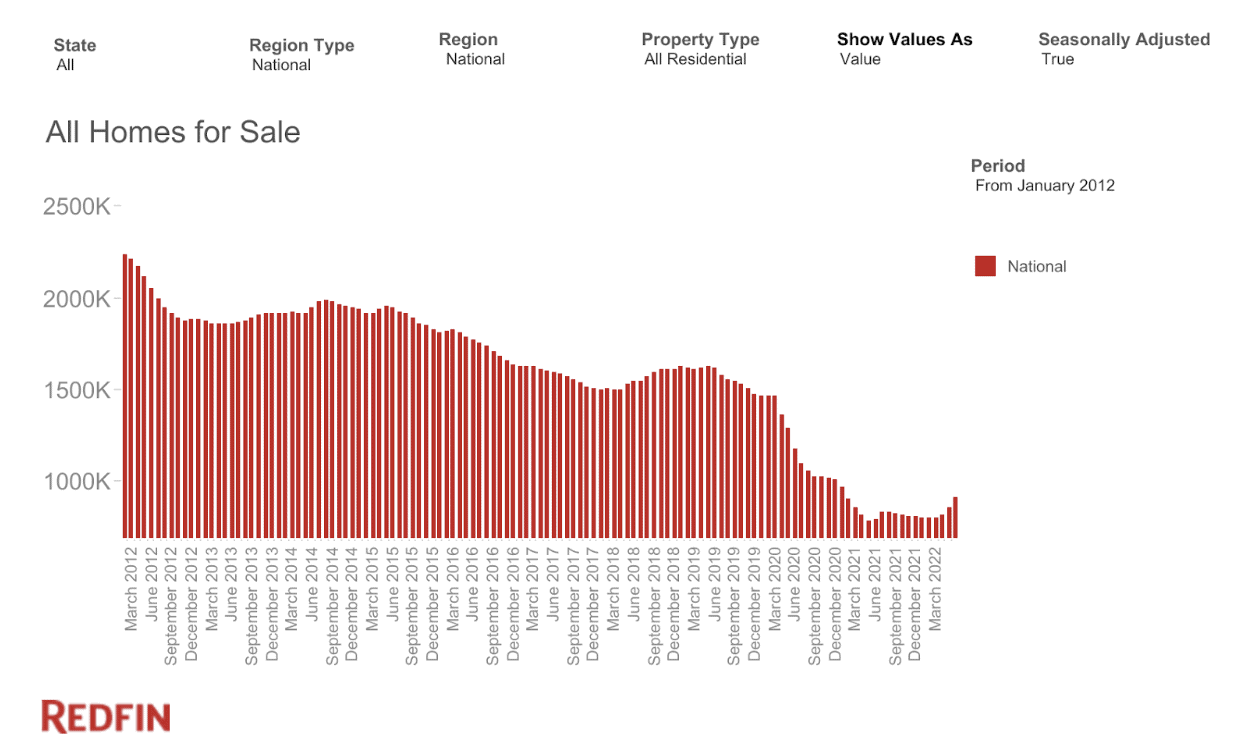 All Homes for Sale (2012-2022) – Redfin
This is important because, as I’ve written about extensively before, if housing prices are going to come down, inventory needs to at least approach historical levels. Clearly, from this chart, that is not happening on a national level yet. But the trend seems to be heading in that direction.
Check out this chart that shows inventory growth YoY. For most of the pandemic, inventory was falling consistently, but now we’re seeing it rise rapidly on a year-over-year basis.
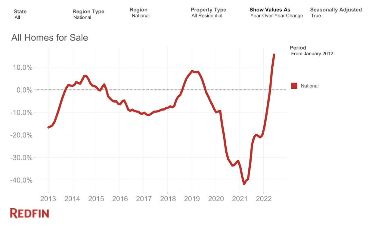 All Homes for Sale YoY Change (2012-2022) – Redfin
Again, we’re still far from normal, but inventory is trending upward. This is a key metric to watch to understand the direction of the housing market in the coming months, on both a national and regional level.
Notably, some markets are seeing inventory levels recover to pre-pandemic levels. This indicates that those markets are at a high risk of seeing YoY price declines (which again, we haven’t yet seen in any markets) in the coming months or years.
Recently, San Francisco became the first market to officially return to pre-pandemic levels. San Jose is right behind and just 1% below pre-pandemic levels, with Las Vegas, Phoenix, and Austin, heading that way as well. Below you can see an example of Phoenix, Arizona.
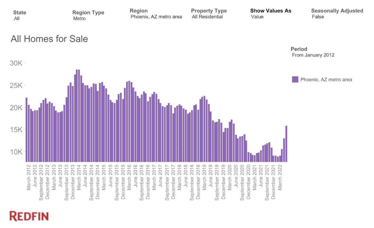 All Homes for Sale (Phoenix, Arizona, 2012-2022) – Redfin
To me, if you want to know what will happen in your housing market in the coming months, check out inventory and days on market. If they start approaching pre-pandemic levels, the risk of price declines on a YoY basis rises significantly.
What This All Means
Of course, we don’t know which markets will decline, but hopefully the above data helps you understand what is happening. To provide more context, we can look at forecasts created by Moody’s Analytics, which predict price growth between now and the end of 2023.
According to Moody’s, three cities in Florida are poised for the greatest declines: The Villages, Punta Gorda, and Cape Coral. Of those, Moody’s predicts The Villages to decline by 13%. That’s a big number! But remember, that’s for the riskiest city. Remember, in the Great Recession, prices fell 20% nationally!
Moody’s also predicts relatively large drops in Reno (-8%), Austin (-7%), San Diego (-6.5%), and Boise (-6.2%).
On the other hand, Moody’s forecast suggests that some cities will grow. On top of that list is Albany, Georgia (+10%), Casper, Wyoming (+8%), New Bern, North Carolina (+7.6%), Augusta, Georgia (+7.2%), and Hartford, Connecticut (+7%).
When I look at all this data in aggregate, I believe the main takeaways to be:
- I still believe the most likely scenario is that some markets decline in the coming year or so, while others continue to grow, just more modestly than over the last few years.
- Even though some markets are showing weakness, I still don’t believe a “crash” is likely, and on a national level, price declines of over 10% are not looking likely.
- Markets that are at the greatest risk seem to be:
- On the western half of the country
- Saw massive appreciation over the last two years
- Have increasing inventory and days on market
- Were big migration hot spots during the pandemic
- Have the lowest affordability.
The markets that continue to show up and, to me, carry the greatest risks, are:
- Austin, Texas
- Boise, Idaho
- Phoenix, Arizona
- Las Vegas, Nevada
- Reno, Nevada
- Fort Myers, Florida
- Denver, Colorado
- Salt Lake City/Provo, Utah
- Spokane and Seattle, Washington
On the other hand, cities that continue to show strength are:
- Hartford, Connecticut
- Baton Rouge, Louisiana
- Virginia Beach, Virginia
- Chicago, Illinois
- Albany, New York
- Honolulu, Hawaii
- Philadelphia, Pennsylvania
So, as you navigate the transitioning market, keep these things in mind. You’re probably going to see a lot of sensationalist headlines in the coming months, but you should keep track of this data for yourself. You can do so on various websites like Redfin and Realtor.com, and of course, I’ll keep publishing my research and articles like this on the BiggerPockets blog regularly.
On The Market is presented by Fundrise

Fundrise is revolutionizing how you invest in real estate.
With direct-access to high-quality real estate investments, Fundrise allows you to build, manage, and grow a portfolio at the touch of a button. Combining innovation with expertise, Fundrise maximizes your long-term return potential and has quickly become America’s largest direct-to-investor real estate investing platform.
Learn more about Fundrise
A big thank you to Pooja Jindal for her help researching this article!
Note By BiggerPockets: These are opinions written by the author and do not necessarily represent the opinions of BiggerPockets.

