Back at WWDC, Apple promised to make the public beta of macOS Ventura available in July. The company stuck to its word, releasing lucky number macOS 13 this morning (alongside the rest) for everyone who likes to live life very slightly on the edge, after rounds and rounds of bug testing.
We’ve been fiddling around with the latest build over the past several days, and are largely satisfied with the upgrades contained therein. I should add the standard caveat here that comes with using beta software, though I’ve not found this latest version to be particularly buggy.
Continuity Camera was the headline feature back at WWDC — both in terms of functionality and just general novelty. It builds upon an earlier feature of the same name, bringing something far more useful for most of us, day-to-day. Download Ventura on your macOS and iOS 16 on a compatible device, and your iPhone will double as a webcam.
I was honestly a bit surprised by how seamless the two worked together. Once the upgrades are complete, your Mac should automatically detect the connected device and offer it in the drop-down menu of compatible video chat platforms. I tried it out on FaceTime, Zoom and Google Hangouts, and they all were able to use the iPhone. As you can see from below, there’s a marked difference in quality between the 14-inch M1 MacBook’s on-board camera (left) and the rear-facing on the iPhone 12 (right).
Big difference between the 14-inch M1 MacBook’s on-board camera (left) and the rear-facing on the iPhone 12 (right). Image Credits: Brian Heater
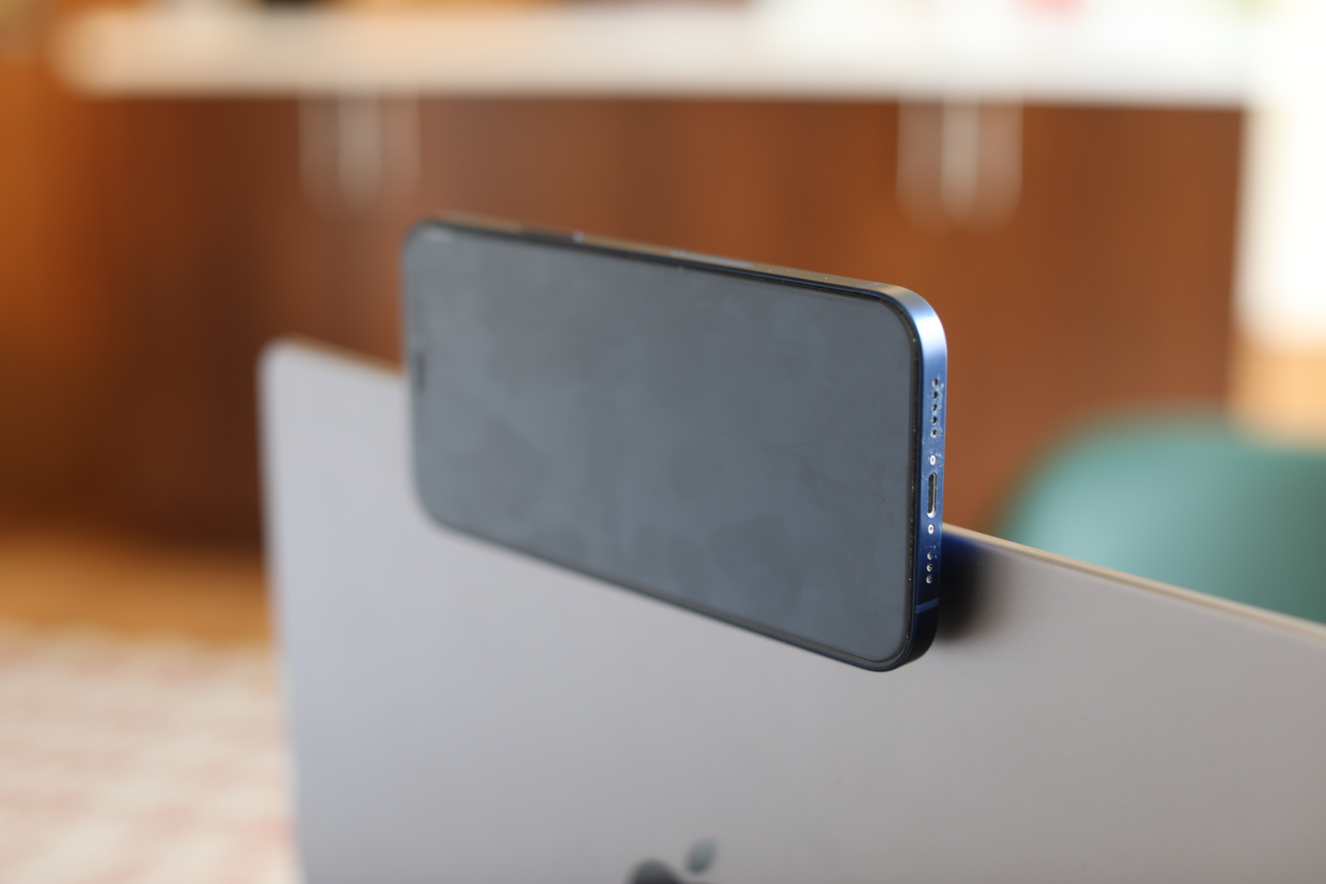
Belkin sent me an early version of their Continuity Camera clip-on to test the system, and that, too, worked well. It utilizes the phone’s MageSafe magnets to snap onto the back. A small, rubber lip lets you rest the phone on the MacBook’s lid. Or you can use the metal ring to stand it up on the desk — though the former makes it much easier to make eye contact while looking at your screen. Like Ventura, the clip-on is still in beta, though again, it didn’t give me any problems.
Honestly, by biggest concern there is the stress the full weight of an iPhone will put on the lid/hinge in the long run. The MacBook wasn’t designed with that in mind, but I guess we’ve got to have faith that the company thinks it won’t put too much strain if they’re actively encouraging users to do it. Obviously, the ideal here would be improving the built-in cameras, but while the company has made the jump from 780 to 1080p on newer systems, the iPhone still wins out.

Apple Belkin Continuity Camera macOS. Image Credits: Brian Heater
Certainly it’s a nice upgrade for those with older, compatible MacBooks, but even sticking an iPhone atop a Mac isn’t the most elegant solution. It’s a nice option to have in these days of remote work. Center Stage works with the feature to follow you as you move and incorporate others into the frame. Desk View is an interesting — if not particularly useful addition — that can shoot your hands via overhead view. More useful is the addition of handoff for FaceTime that makes it possible to quickly switch between devices while on a call.
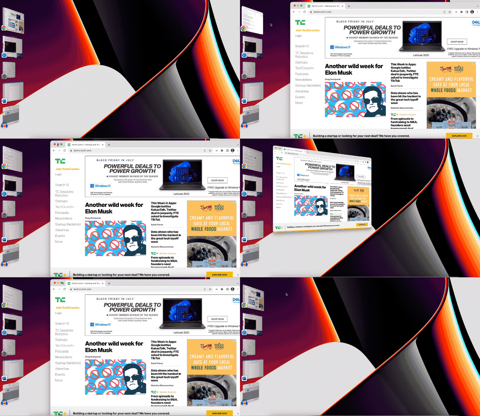
Stage Manager is the other feature I’ve found myself most regularly utilizing since downloading Ventura. I’m always skeptical of any new workflow feature. I tend to find these things interesting in my initial review, but they never really stick. Maybe it’s my own scatterbrained approach to working, or maybe the features haven’t been baked into the end user experience in a way that lends itself to stickiness (maybe both?). After a few days or weeks, I tend to forget about them altogether.

Image Credits: Brian Heater
As a fairly chaotic desktop window user, I’m once again optimistic here. This is partially due to the feature being on by default. It utilizes macOS’s real estate to create a kind of sidebar where the rest of your open apps sit. The windows are organized by stacks, and your messy desktop files disappear into the ether. When windows are minimized, move over to that left side bar, rather than the tool bar.
Double clicking the desktop makes the feature disappear and surface your desktop files. Click the left sidebar and Stage Manager will reappear. You can also manually drag and drop windows to and from Stage Manager, if you want to have multiple apps front and center. Some other little bits of functionality would be nice, like the ability to drag and drop windows to reorder, but again, I’m cautiously optimistic that my disorganized app will be able to incorporate the feature into my workflow.

Image Credits: Brian Heater
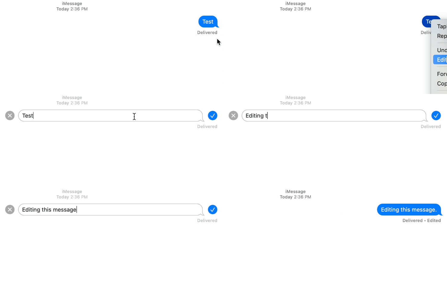
Those two features are the most exciting day to day additions, but some others warrant call out. Undo Send for Mail is a long awaited one, giving you a few extra seconds to rethink that message. This has saved my butt more than once on Gmail, and it’s nice seeing it added to Mail. That comes along with an improved search that populates the bar as you type.
The system’s Spotlight search has been improved, as well, with better indexing for images found in Messages, Notes, Photos and more. Spotlight is also getting a shortcut that allows you to perform simple functionality, like setting and turning on Focus sessions from the browser.
The OS’s system’s setting have gotten a long overdue overhaul. The new version is cleaner and — more to the point — iOS like. Freeform, meanwhile, is the white board feature the company previewed at WWDC. That one is still listed as “Coming Soon,” however, so we can’t share any hands-on impressions there. More soon.
MacOS 13 Ventura is available now as a public beta.

