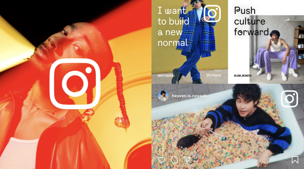
Instagram is rolling out a “visual refresh” for its branding this week, the company announced in a blog post on Monday. The company is introducing a slightly-tweaked new logo gradient, typeface and full-screen marketing layouts. Instagram says the new refresh is designed to embrace continued evolution and to help it “create more immersive and inclusive experiences.”
The new typeface is called “Instagram Sans” and was inspired by Instagram’s logo. Instagram notes that the font was inspired by squares and circles, or “squircles.” The new typeface also includes multiple global scripts. The company says Instagram Sans is a contemporary remix of grotesque and geometric styles. Among the new fonts is Instagram Sans Regular, Bold, Light, Medium, Condensed and Condensed Bold. You can play around with the new fonts here.
Image Credits: Instagram
“Instagram Sans is a new way for our global community to express themselves on Instagram in places like Stories and Reels,” the company said. “While designing this new typeface, our goal was to make Instagram Sans globally accessible. We partnered with language experts around the world to adapt the typeface to global scripts including Arabic, Thai and Japanese. We want to support all of our creators and community members who push culture forward to express themselves fully in any language they choose.”
As for the new logo, the gradient is now a bit more vibrant to make it feel “illuminated and alive,” the company says. Instagram notes that the gradient was reimagined using a 3D modeling process. In terms of the new full-screen marketing layout, Instagram says it’s designed to be “content-forward” and celebrate simplicity.

Image Credits: Instagram
The launch of the full-screen marketing layouts come as Instagram has been testing a TikTok-like full-screen home feed. The layout impacts the way photos are displayed in the home feed, and history shows that anytime Instagram changes the way posts appear, it causes some controversy. In the test of the full-screen home feed, you can still use the bottom navigation bar to access the discovery tab, Reels, shopping and your own page. The icons to switch accounts, create a post, check your notifications and browse your messages are still on the top bar, too.

